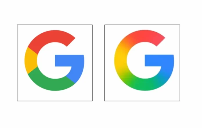
Google has given its well-known ‘G’ logo a fresh look for the first time in nearly a decade. On May 12, 2025, Google Updated Its Iconic ‘G’ Logo After 10 Years. Google G logo update marks a significant shift in the company’s design approach. While the change may seem small, it represents a significant shift in the company’s design approach.
The new Google icon features a smooth gradient that blends Google’s classic colours: red, blue, green, and yellow. The old sharp colour blocks are gone, replaced by a cleaner and more modern design that shows Google’s focus on simplicity and AI-driven experiences.
Hey there! There’s a well-known saying that change can make or break, and this holds especially true for fast-paced digital world. Even a small change in branding or a logo can lead a company toward significant progress or pose challenges.
With this update, Google is ready to take on new challenges! The new logo isn’t just a change in appearance; it shows that Google is keeping up with the times. By updating its design, Google reminds us that staying relevant means always changing and growing, no matter how big you are. It’s an exciting sign of innovation. If you’re curious to explore the most useful features of Google app, take a look at my article on how to enable dark mode on Google App – step-by-step guide, there’s a good chance you’ll find something you’ll love.
What’s New in the Updated Google Logo?
The updated design is subtle yet important. Instead of solid colours, the “G” now has soft transitions between shades. It looks more polished and fluid, fitting well in today’s AI-focused world.
You can already see the new logo in the Google Search app on iPhones and Pixel devices, and it will soon be available on Android devices in the latest beta version (16.18). Over the next few weeks, it will likely appear across all major Google services.
I’m using the Google Pixel 3XL right now, and I just got the new Google logo in the beta version of the Google Search app. You can see what it looks like in the screenshot below. It’s definitely more modern and stylish compared to the old one.

Why the Change?
This is the first major update to the Google logo since 2015, when the company changed its font to a more modern, sans-serif style. That update also introduced the familiar multicoloured “G” icon we see on everything from Chrome tabs to mobile apps.
The new gradient design aligns with Google’s recent work on Gemini, its AI brand, which also uses similar gradient styles. This change shows that Google is unifying its visual identity, with AI at the centre of this evolution.
More Logo Changes on the Way?
While only the “G” icon has been updated for now, this refresh could lead to more changes. Many users expect Google to make similar design updates across other apps like Gmail, Maps, and Chrome, creating a more cohesive and modern look throughout its services.
What This Means for Users
For casual users, the new logo might seem like a small update. However, for designers, developers, and long-time Google fans, it’s a sign that the company is always evolving. The updated “G” is not just a visual change; it reflects Google’s commitment to innovation, simplicity, and staying ahead in a fast-changing tech world.
We want to know what you think about Google Updates its Iconic ‘G’ Logo After 10 Years. Learning more about this change can really improve your experience with the brand. If you have any insights, questions, or stories related to this update, please share them in the comments below. Your feedback can be helpful to others interested in this exciting redesign.


